
Background
Location-based services make discovery easy, but accessibility remains difficult to navigate
While users can easily find information about places to visit, accessibility details are often scattered across reviews, photos, and business descriptions, making them difficult to find and evaluate.

Survey
Many users value accessibility but hesitate to rely on current platforms because details feel incomplete, inconsistent, or hidden. This gap creates uncertainty and forces extra effort, reinforcing the need for clearer, prioritized categories like entrances, ramps, and restrooms to guide confident decisions.

Pain Point in Planning a Trip in a Wheelchair
Incomplete accessibility details create unnecessary effort and frustration

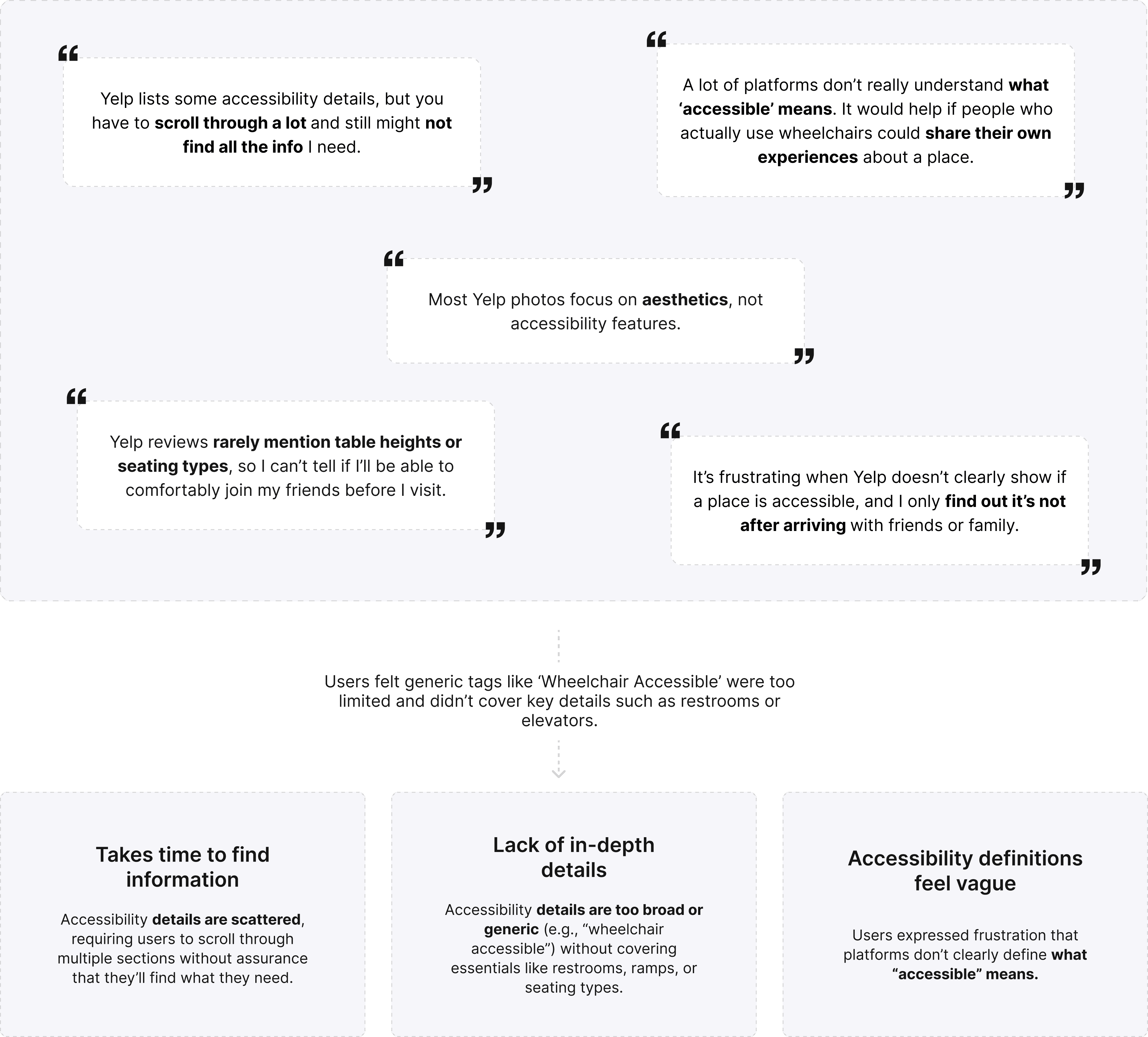
User Interivew
Users struggle with fragmented, shallow, and unclear accessibility information on Yelp

Opportunity
Make accessibility information easier to discover, understand, and trust

Design Solutions
#1. Personalized accessibility discovery
Accessibility information adapts to each user’s mobility needs and preferences.
1
Making accessibility personal
Accessibility is not one-size-fits-all. Bridge surfaces information based on what matters most to each user.

2
Prioritizing relevant venues
Personalized “For You” tags indicate venues that match a user’s accessibility needs and preferences.
→ Reduced decision-making effort

#2. Making accessibility easy to scan
Accessibility information is organized into structured categories and semantic labels, allowing users to quickly understand and compare venues without digging through reviews.
1
Scannable Accessibility Pins
Accessibility conditions are visualized directly on the map using distinct colors and icon shapes for faster recognition and color-blind accessibility.
→ Reduced decision-making effort


2
Semantic Accessibility Labels
Structured 3 different accessibility labels help users quickly understand venue conditions without digging through reviews.


#3. Delivering rich and clear accessibility information
Move beyond accessibility labels to understand real-world accessibility conditions before visiting.
1
Beyond accessibility labels
Community insights and recent updates help users understand real-world conditions before visiting.
Accessibility breakdown
Community verification
Good to know
→ Users gain the context needed to make informed decisions before arriving.
2
Community-powered accessibility updates
Visitors can contribute updates, photos, and accessibility notes to keep venue information accurate and current.
Category-specific updates & photos
Notes can be attached directly to:
Entrance
Restroom
Elevator
Parking
Interior Space
Staff Assistance
→ Accessibility information remains current, trustworthy, and grounded in real visitor experiences rather than static business descriptions.
Semantic Color System
A dedicated semantic color system helps users quickly distinguish accessibility conditions while maintaining visual consistency throughout the experience.


Reflection
Through this project, I realized that accessibility is not simply about providing more information, but about helping people quickly understand, trust, and act on what is most relevant to their individual needs.
♿️ Move beyond physical features to consider personal needs, community insights, and real-world context as part of the accessibility experience.
✏️ Leverage community contributions, recent updates, and on-site confirmations to improve the reliability of accessibility information.
♟️ Adapt recommendations to individual mobility needs, priorities, and contexts to create more relevant experiences.

