
Background
Accessibility information is often hard to find and lacks sufficient detail
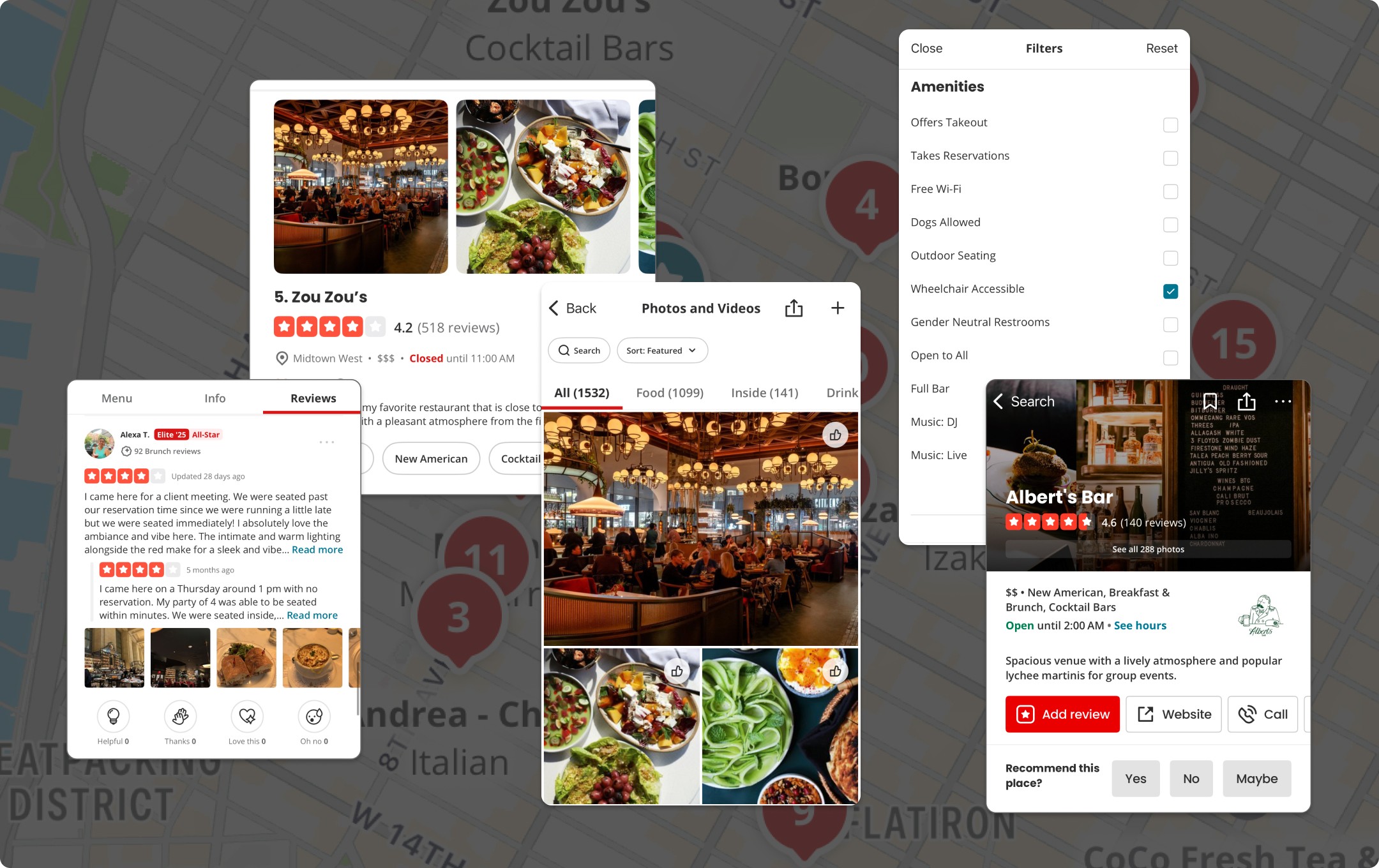
Yelp is a leading platform for discovering local businesses, but accessibility information is often buried or limited. This makes it hard for users to find the in-depth details they need before visiting a place.
Pain Point in Planning a Trip in a Wheelchair
Incomplete accessibility details create unnecessary effort and frustration
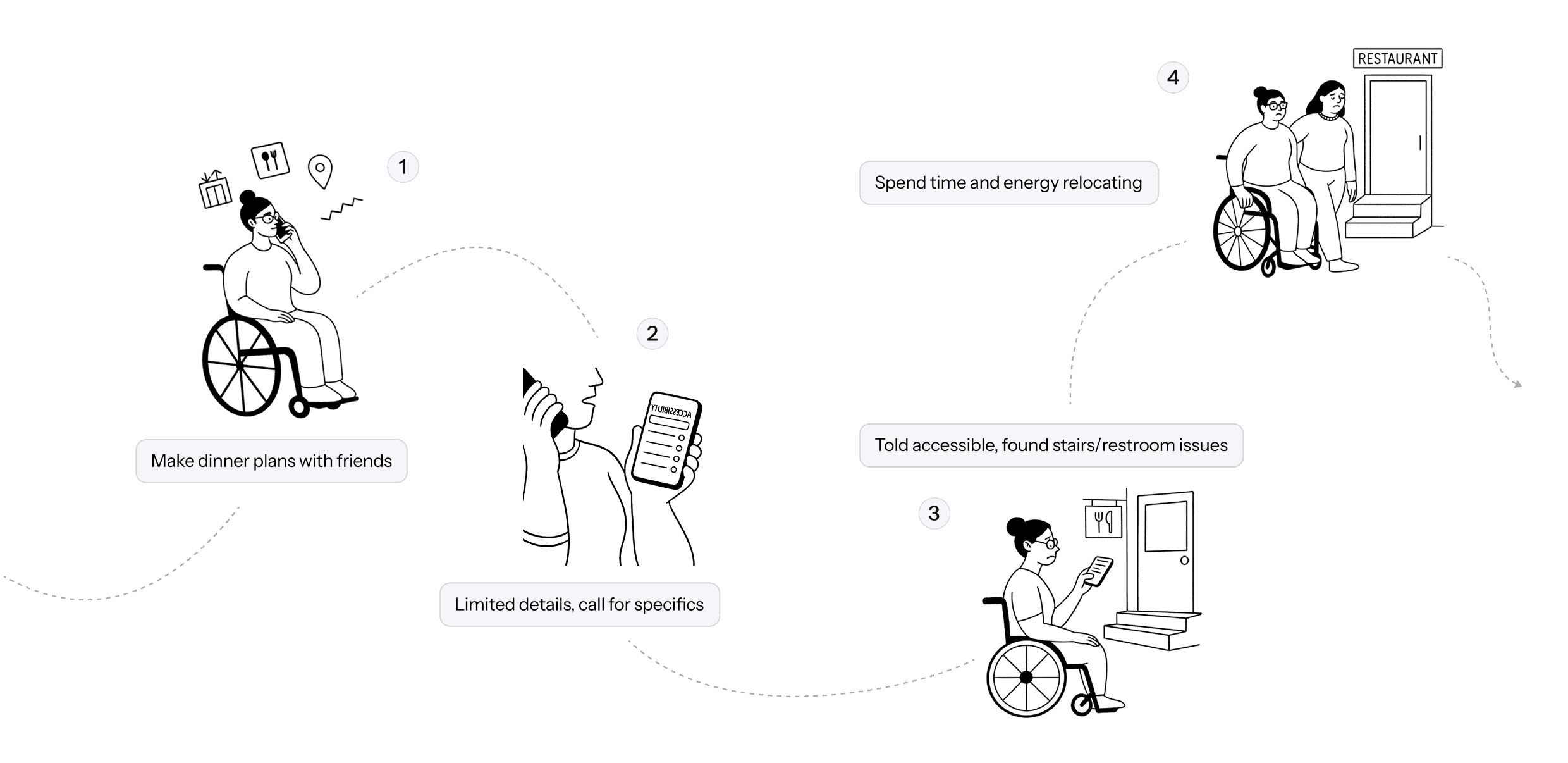
User Interivew
Users struggle with fragmented, shallow, and unclear accessibility information on Yelp
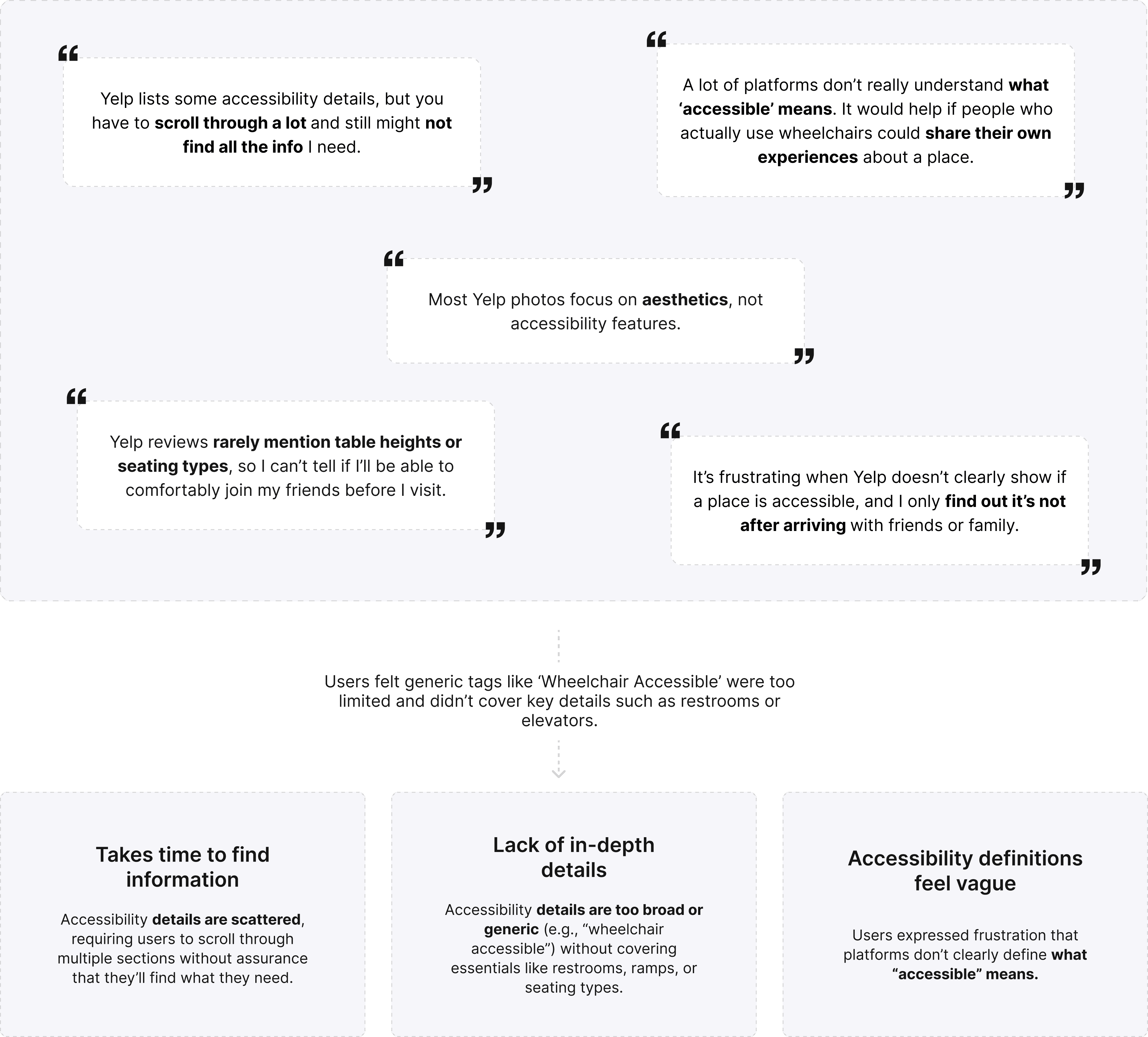
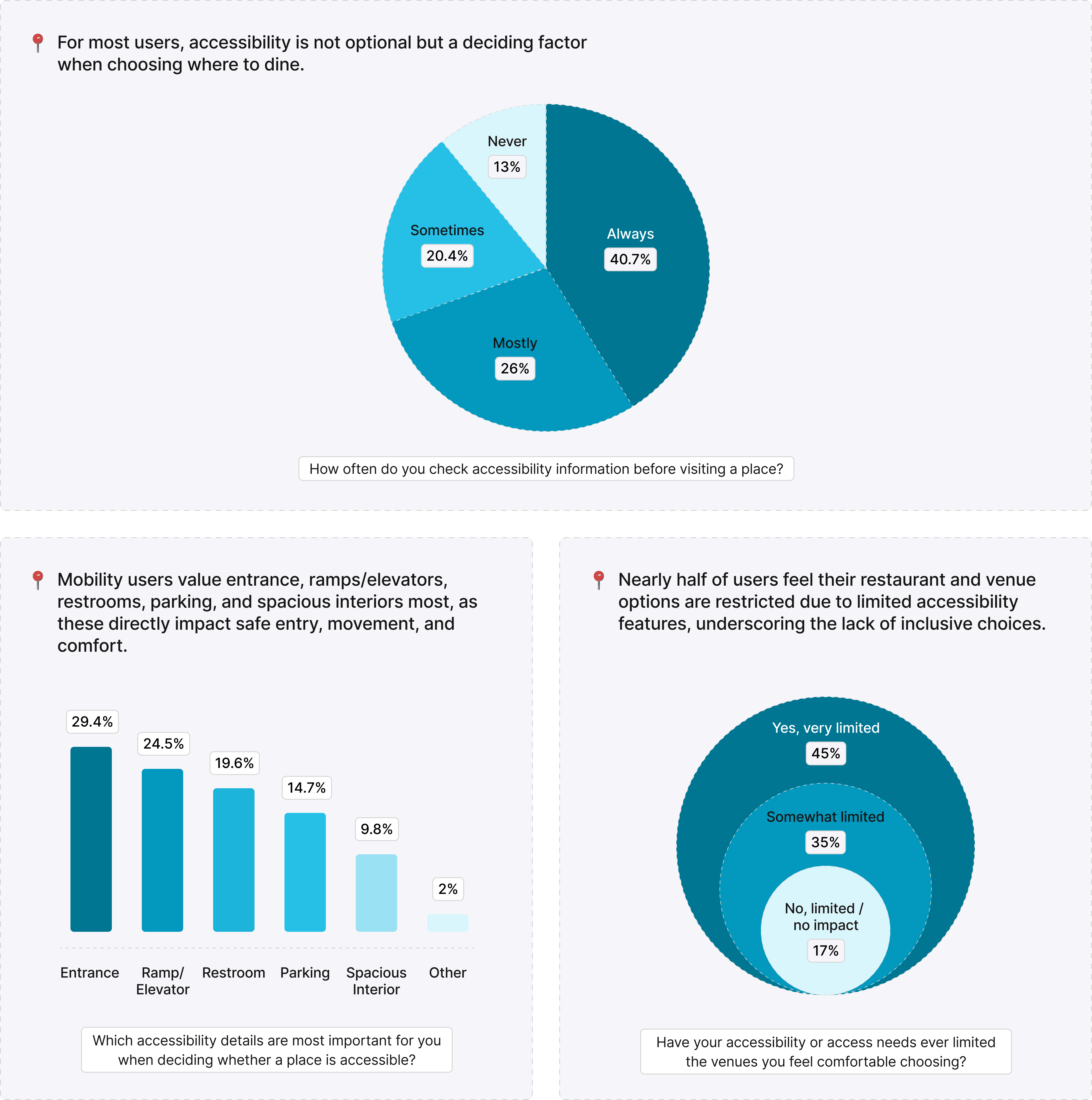
Survey
Many users value accessibility but hesitate to rely on current platforms because details feel incomplete, inconsistent, or hidden. This gap creates uncertainty and forces extra effort, reinforcing the need for clearer, prioritized categories like entrances, ramps, and restrooms to guide confident decisions.
Identifying Problems
1. Search & Filtering Experience
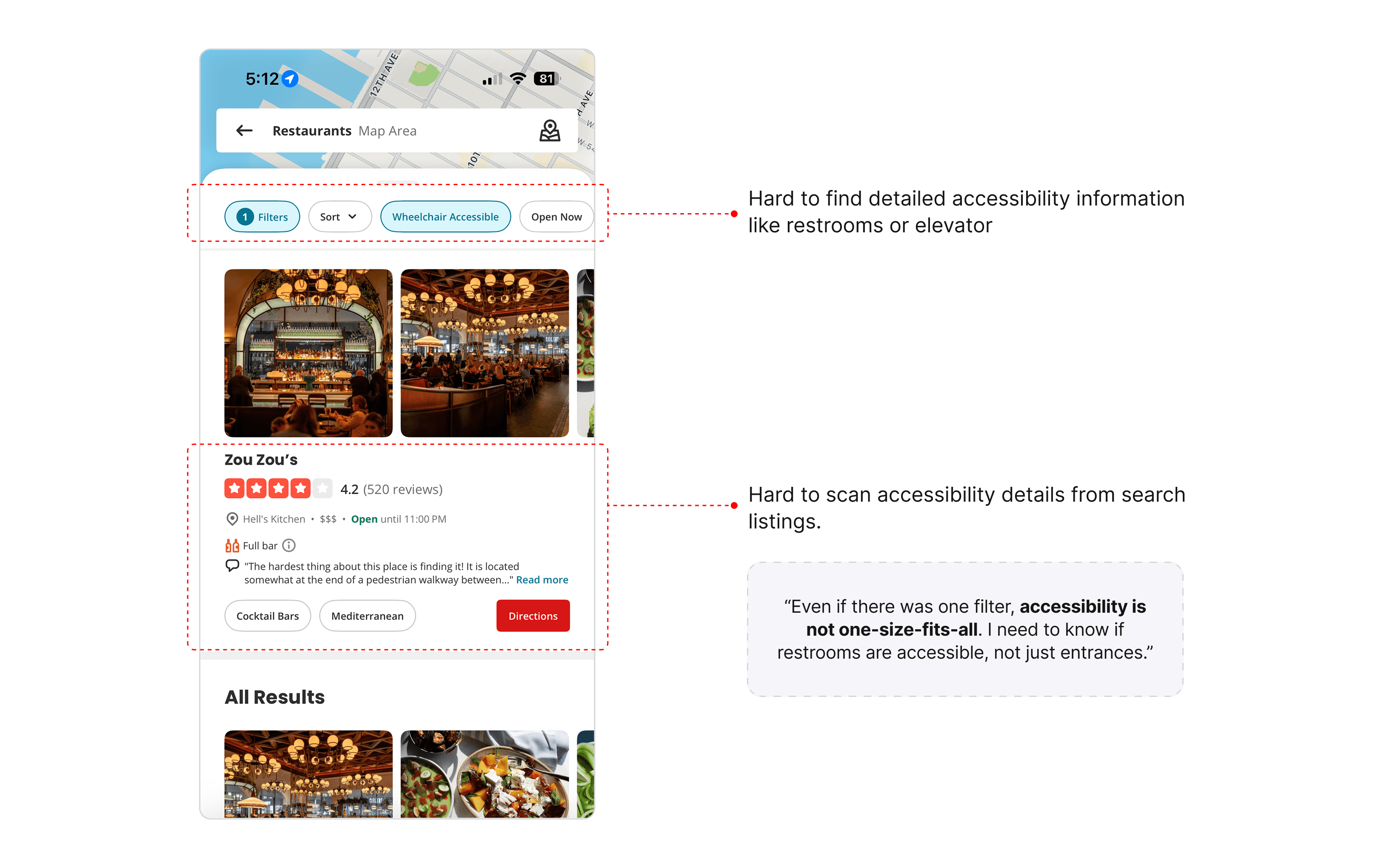
Search results make accessibility info less scannable and too limited, leaving users uncertain about key details

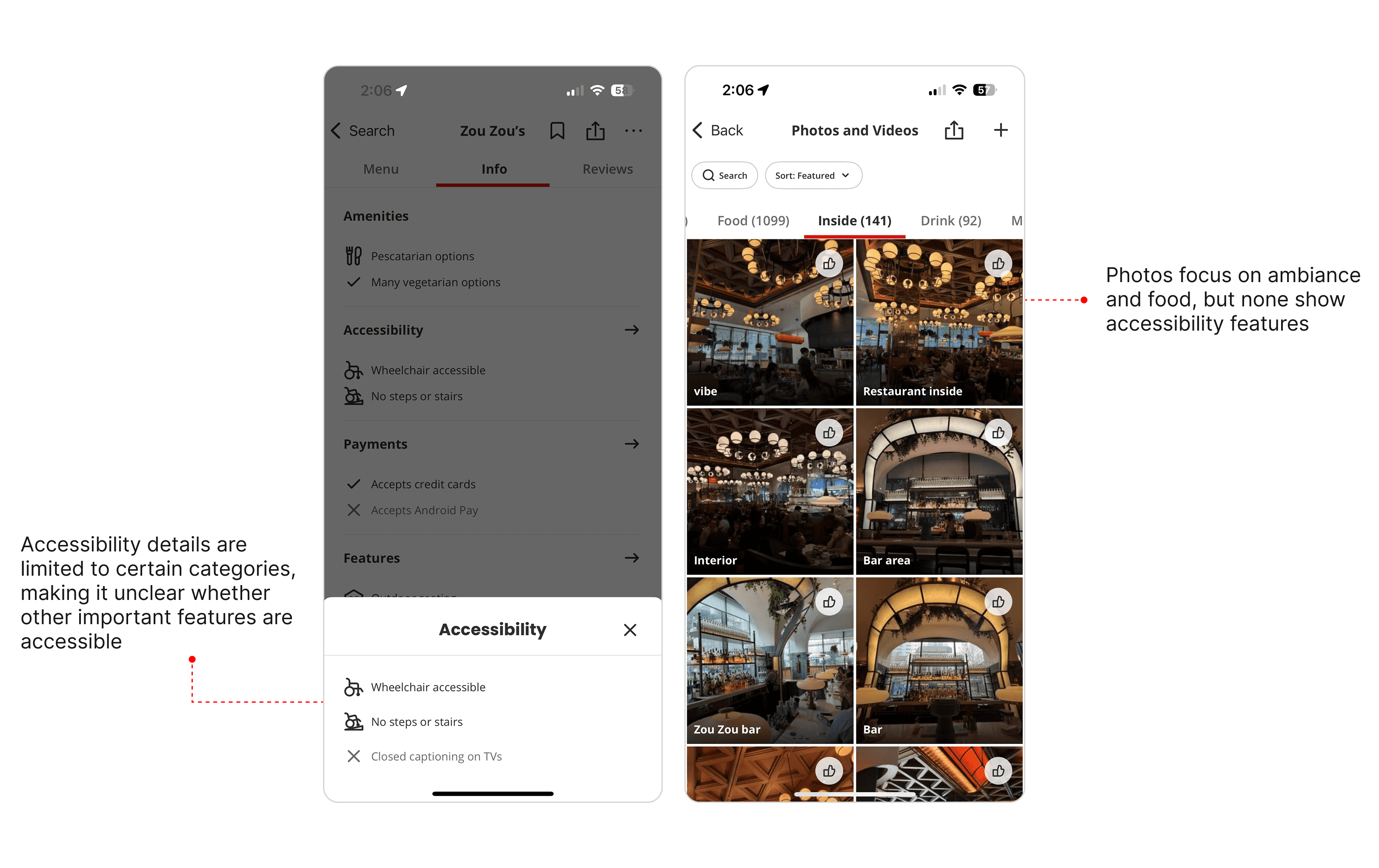
2. Accessibility information is lacking in depth and clarity across text and visuals
Search results make accessibility info less scannable and too limited, leaving users uncertain about key details
Design Solutions
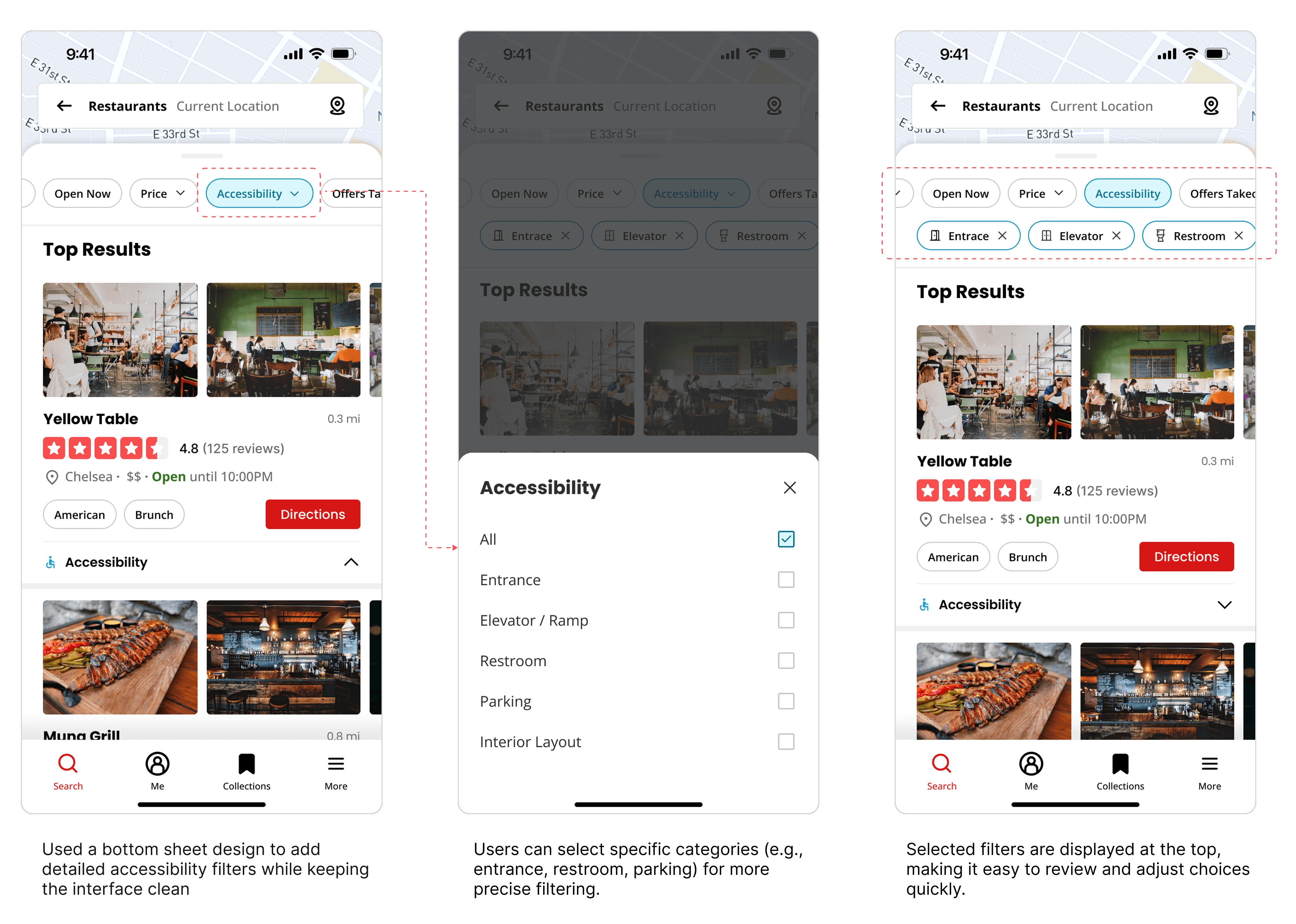
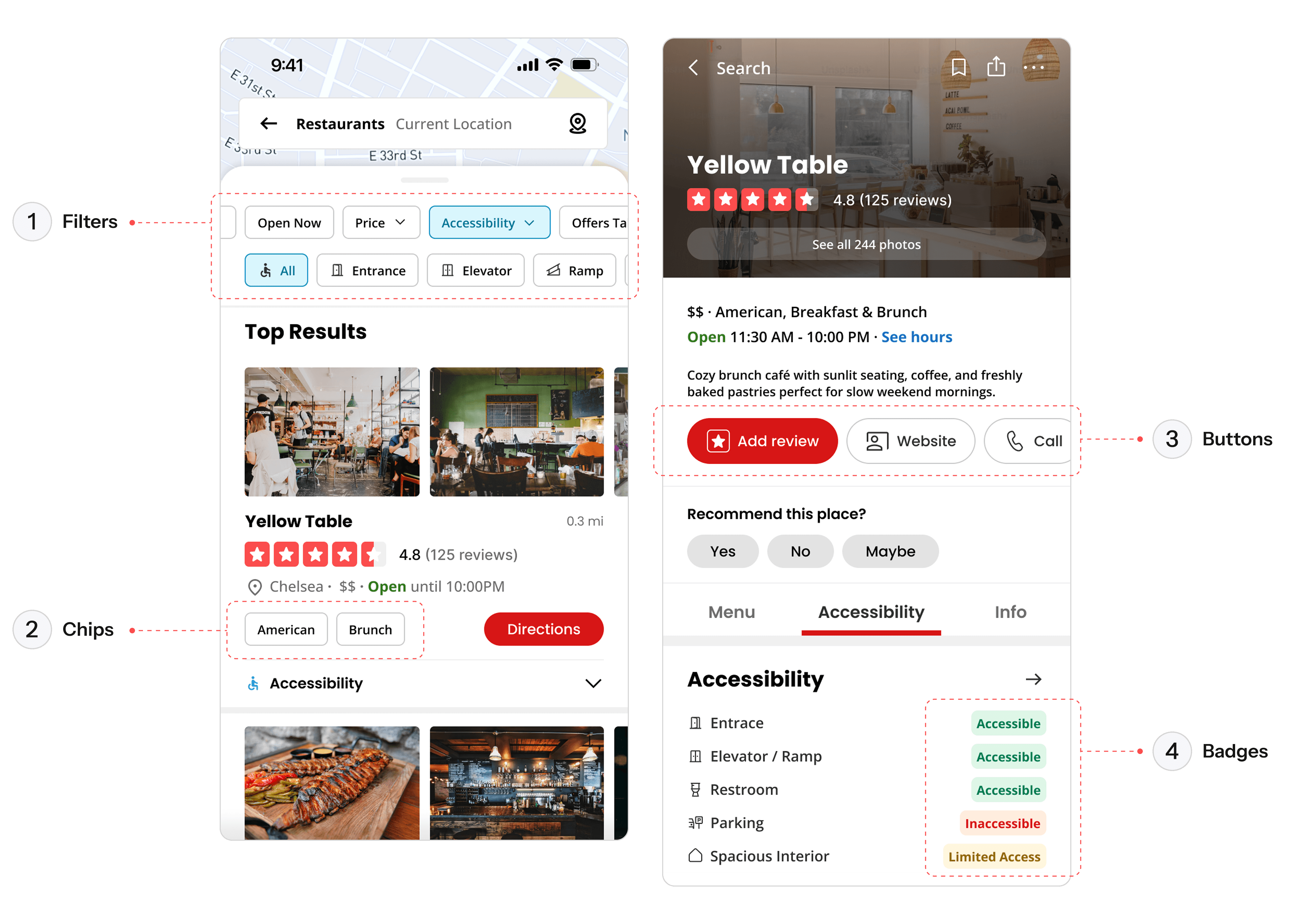
#1. Easy-to-find accessibility info with filter system, without visual clutter
By introducing a structured filter system, users can quickly locate the accessibility details most relevant to them. Categories like entrances, restrooms, and parking are clearly surfaced, and selected filters remain visible at the top, balancing efficiency with a clean, uncluttered interface.
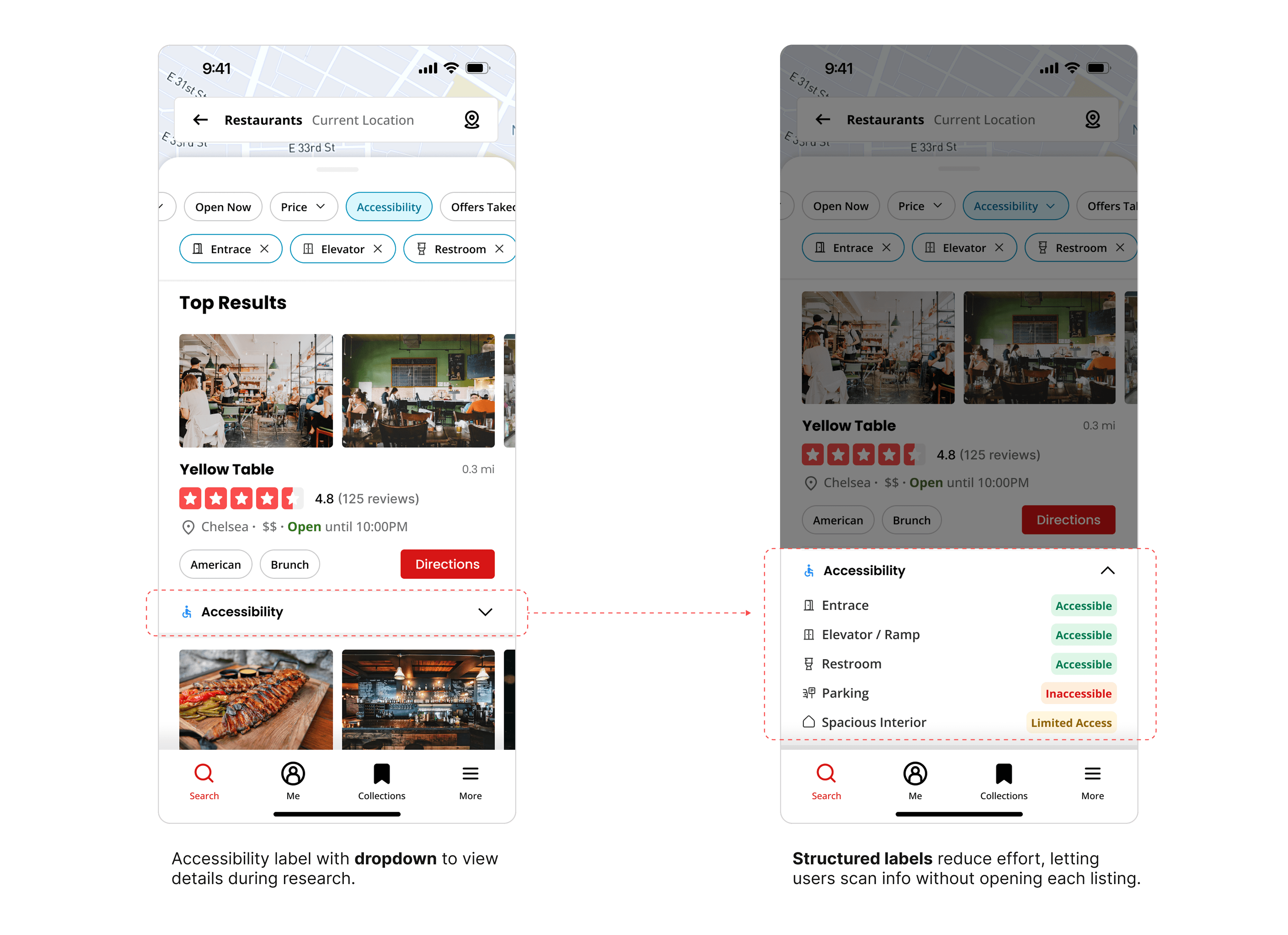
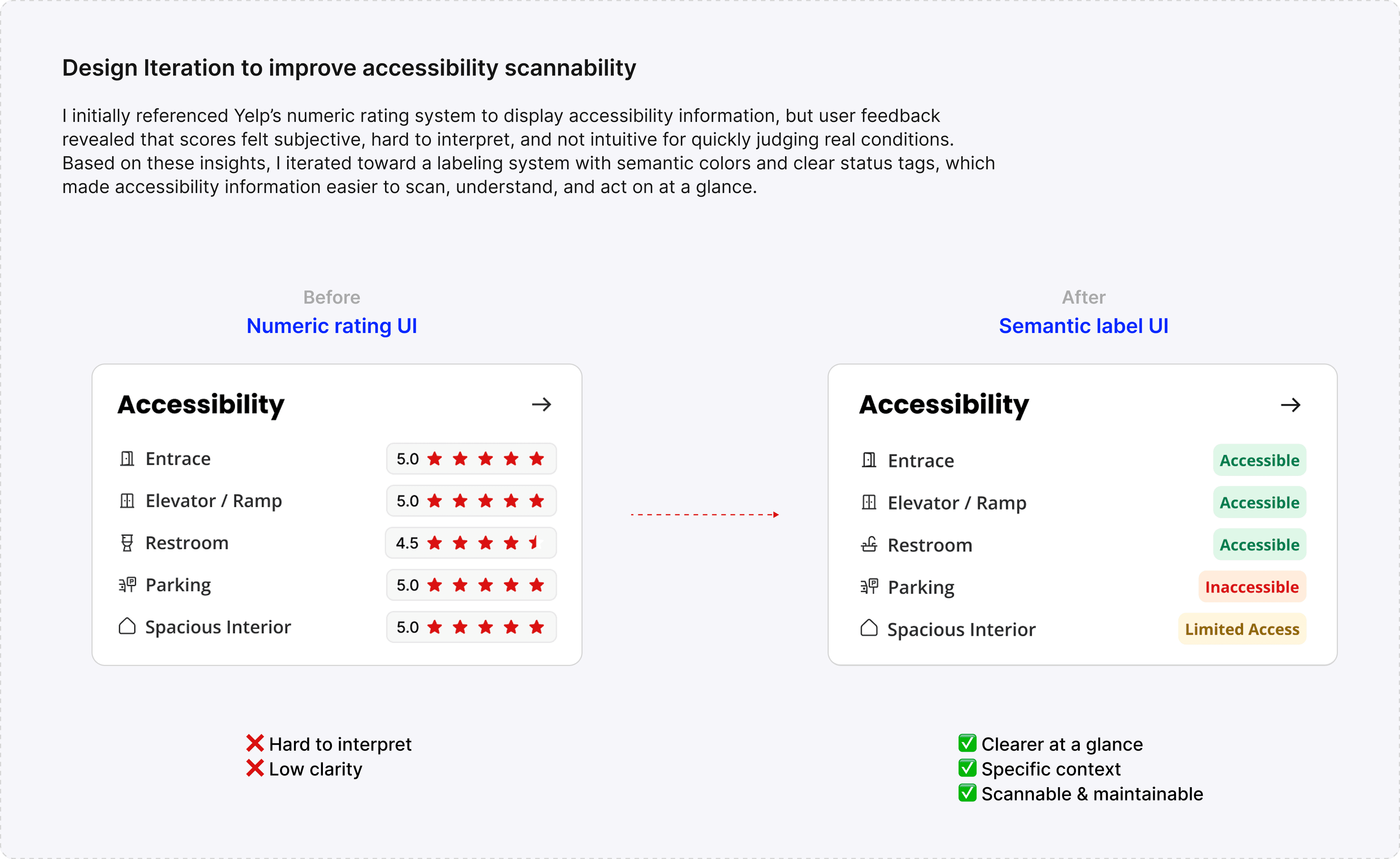
#2. Enhance the scannability of accessibility details
Dropdown labels with semantic color indication organize accessibility details into structured categories, helping users scan quickly without opening each listing. This also prevents visual overwhelm for general users by keeping details hidden until needed.

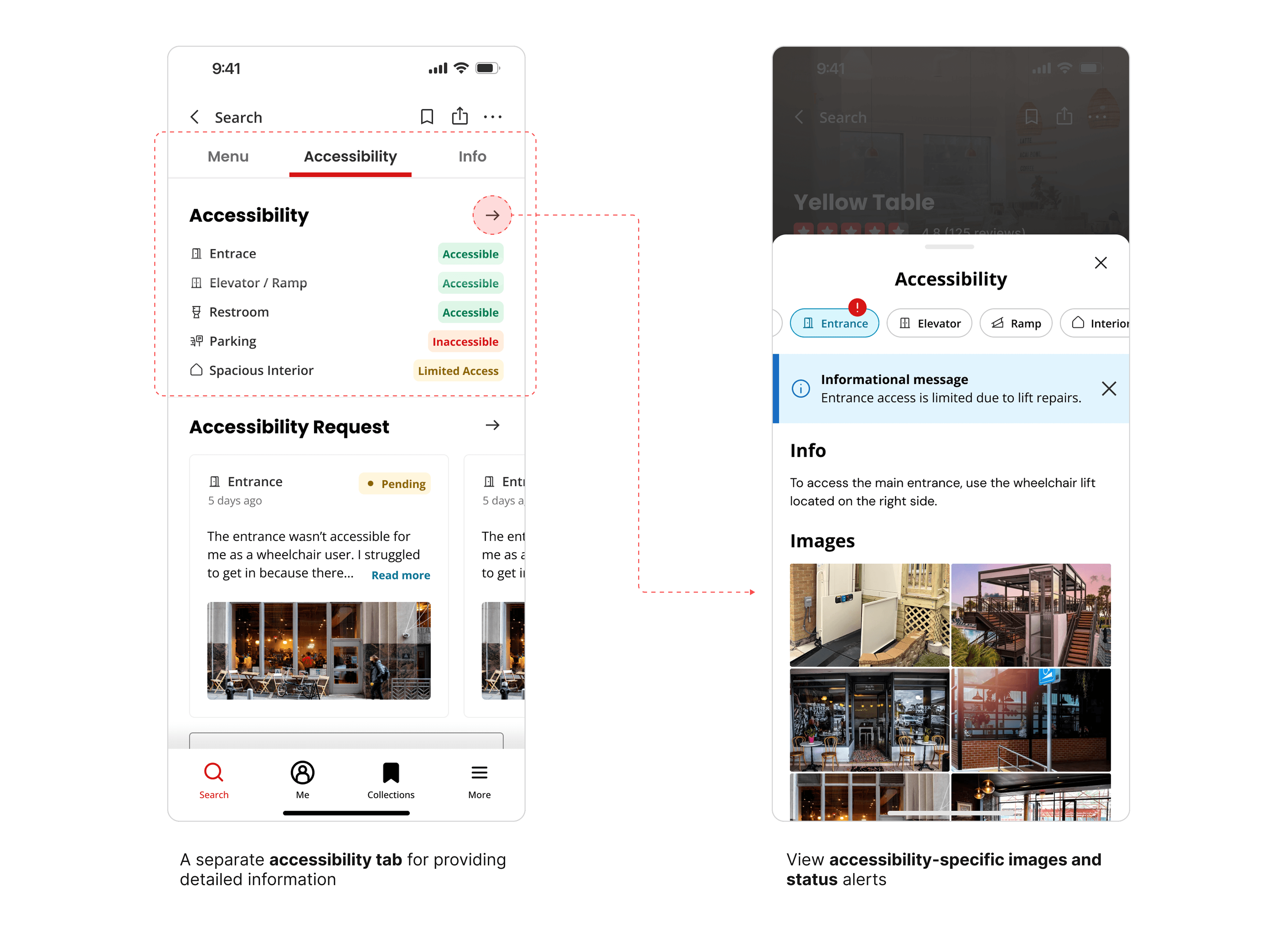
#3. Delivering rich and clear accessibility information
Users can now access a dedicated accessibility tab that organizes detailed metadata into clear categories and labels. Alongside text, the system incorporates images and status alerts, helping users quickly understand real accessibility conditions without uncertainty.
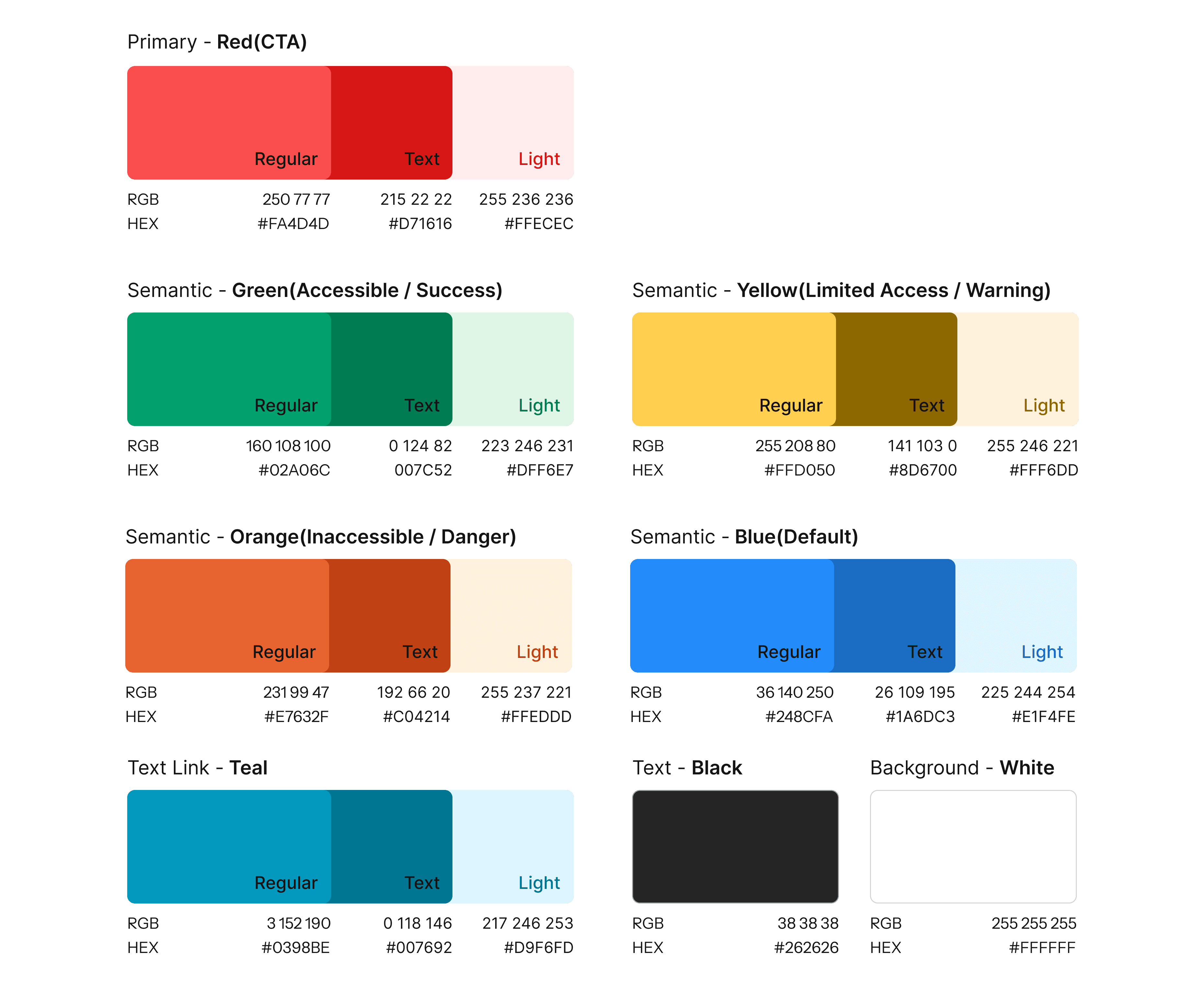
Color System
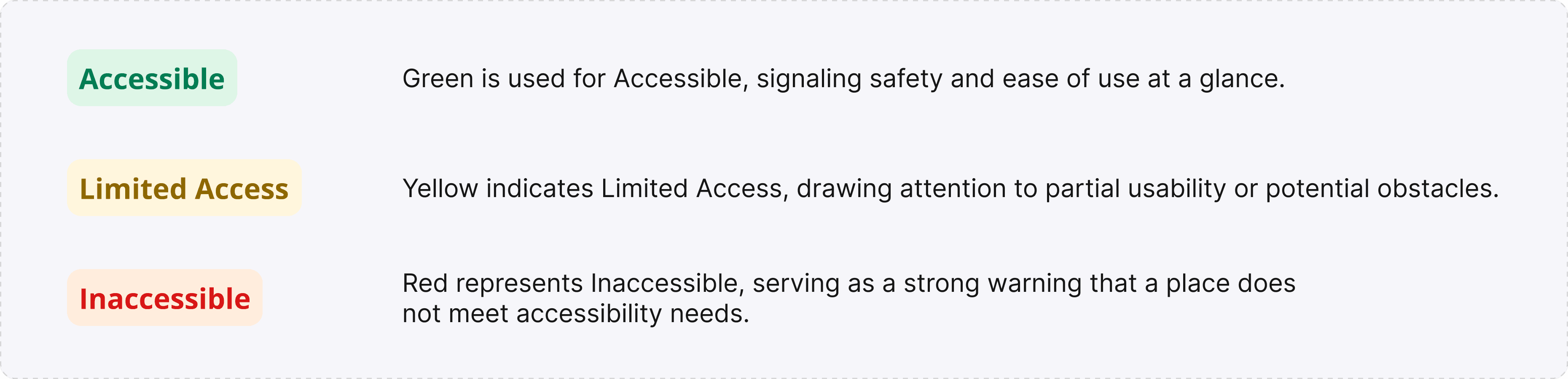
Extended Yelp’s brand color palette into a semantic system, establishing new rules for clear accessibility status communication.
Improved Affordance
By standardizing chips, filters, and badges into square shapes and making buttons rounded, the system balances consistency with clear action cues.
Consistency for Recognition
Filters, chips, and badges are standardized into square shapes to maintain visual uniformity, helping users quickly recognize categories without confusion.
Affordance for Action
Buttons are rounded intentionally to stand out as tappable elements, signaling clear actions and guiding users toward the next step.
Reflection
My redesigns represent an important step toward balancing Yelp’s visual identity with a more inclusive experience. Some of the key reflections and next steps I identified include:
🎤 Conducting further user testing and interviews to validate whether the redesign improves clarity, scannability, and trust in accessibility details.
✏️ Exploring ways to maintain visual consistency while embedding accessibility cues, ensuring that changes feel natural within Yelp’s established brand identity.
♟️ Refining the design system with accessibility in mind, including typographic hierarchy, semantic colors, and clearer affordance patterns for universal usability.

